Raindrop Charts in Python in 5 steps.
Making raindrop plots using Yfinance, Pandas, and Plotly.
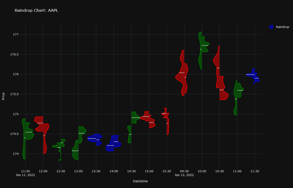
Raindrop charts are one of the latest chart types to appear in the financial industry. Brought forward by TrendSpider in a 2019 whitepaper, they offer a compelling alternative to traditional Japanese Candlestick charts.
Why should I use Raindrop charts?
When it comes to analyzing a stock’s price action, Japanese candlesticks are the go-to chart type. But they suffer from a significant drawback: they do not depict trading volumes. For this reason, they are often shown with a volume bar chart beneath them.
However, this still doesn’t give us a complete picture of the price action. The candlesticks do not illustrate how a stock was trading inside of a single candlestick. OHLC (open-high-low-close) prices do not necessarily reflect most trades. A typical example can be found in the presence of long legged Doji patterns. The Open and the Close are very similar but the price has moved heavily between the High and the Low. The candlestick chart just does not indicate if most trades were happening above or below the Open-Close line.
On the other hand, raindrop charts depict the volume profiles for the first and second half of each interval. The VWAP (volume-weighted average price) is usually shown using a horizontal line. Like this, we get a clearer picture of where most of the volume was trading and in what direction the market was moving.
So without further ado, let’s make our raindrop charts using Yfinance, Pandas, and Plotly.

Step 1: Installing the required libraries
With your anaconda prompt or terminal open, let’s type:
pip install yfinance plotlyNote: Pandas is included in yfinance.
Step 2: Getting the data
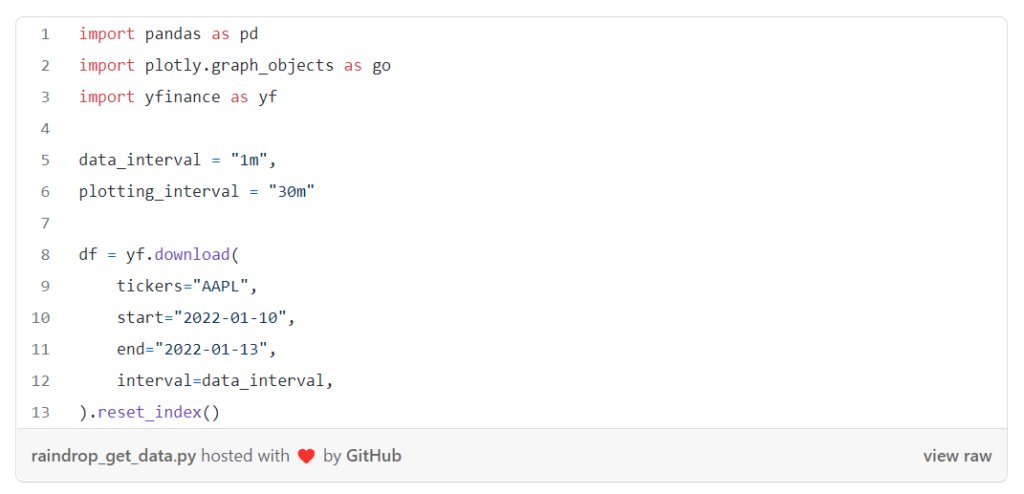
To make raindrop plots, we need to group multiple data points into a single interval. For this reason, it is important to download the data in an interval that is smaller than the interval in which we want to plot. The smaller the interval, the more representative our charts will be of the true price action. In our example, we collect OHLC data for Apple in a 1 minute interval for a period of 3 days and we display the data in raindrops of 30min.

Step 3: Manipulating the data
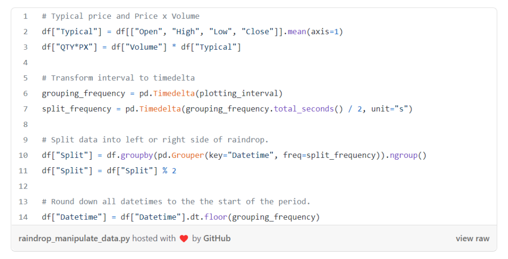
For our plot, we first need the typical price and the Price x Quantity values.
We then split the data into a Left or Right side of a raindrop and attribute the data to a particular raindrop by rounding down the Datetimecolumn using our plotting_interval.

Step 4: Plotting our raindrops
We first define what we consider to be a significant change in the VWAP using the margin parameter (in our case 0.1).
Starting with an empty figure, we go through each raindrop period as such:
- We first determine if we are in a downtrend, uptrend, or period of tight trading. If the VWAP of the first half of the period is higher than that of the second by more than the value of our margin, we are in a downtrend (red). If the former is smaller than the latter by more than the value of our margin, we have an uptrend (green). If neither is true, we are in a period of tight trading (blue).
- Then, we multiply each row by the volume of each interval. This will ensure that we are seeing a volume-weighted profile of the prices making up each raindrop. To avoid exhausting our computer’s memory, we reduce the volume of each period by a specific scalar. In our case, we created our
volume_dividersuch that the interval with the highest volume only gets multiplied by 1000. - Finally, we add our data to our figure using a Violin plot. If the data corresponds to the first half of a period, we add it to the negative side. In the opposite case, we add it to the positive side. We apply the hard span mode so that our violins do not go beyond our min/max price. We scale each violin with respect to the total volume in each raindrop using the scalemode and scalegroup attributes. This allows us to determine if one half had more volume than the other. Finally, we remove the sample points and add a horizontal white line for the VWAP of each half.

More information on how to make/customize split-violin plots in Plotly can be found here: https://plotly.com/python/violin/#split-violin-plot
Step 5: Final Touches
To make the graph more appealing, we give our figure a title, labels, and a few more touches. Note: We are hiding the hours during which the markets are closed to avoid having too many empty intervals.

Conclusion
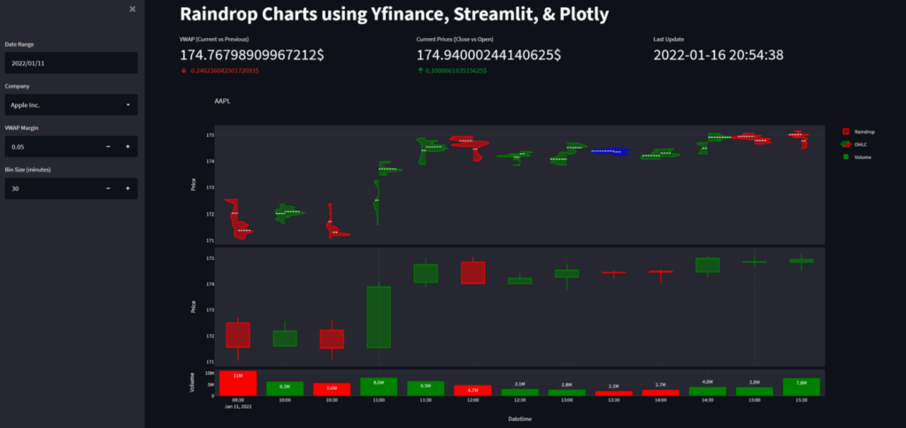
Inthis tutorial, we have seen why and how to recreate raindrop charts in Python. If you liked this tutorial, then why not check out the live demo I made using Streamlit and Streamlit Cloud: https://share.streamlit.io/lucasjamar/raindrop-charts/main/app.py. It gives an interesting comparison between raindrops and candlesticks as they sometimes point in different directions🤔. The full code behind the app can be found on Github: https://github.com/lucasjamar/raindrop-charts
Otherwise, please let me know if you have any questions or feedback in the comment section below.
If you are interested in more amazing visualizations of financial data, why not have a look at my article on creating professional candlestick charts.

